The latest addition to Toronto’s subway network was born yesterday! Six new subway stations were stuck on to the end of line 1 at Sheppard West (formerly Downsview station) and opened to the public on December 16th. If you’re curious about how it came to be, an excellent article by Oliver Moore and Jeff Gray covers that topic here, revealing just how much politics can trump thoughtful planning, even for such a massive project.
But my purpose with this post is to look forward, not back. One way to determine the next best subway project to start working on is by looking at the current demand versus capacity. Based on the latest ridership survey info available from the TTC, it’s possible to draw a pretty good picture of which routes people are taking and each line’s capacity to serve them. In other words; congestion.
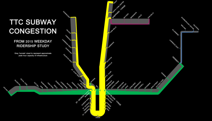 Note: Background on how graph was made and its limitation are at the end of this post.
The new subway addition is not shown here, but extends up from Downsview station. It will be interesting to see the changes the new line will bring to the network in the next study, but some of them can be predicted in advance.
Obviously with the extension, the western section of line 1 (yellow) will see more traffic. This should not present any problem as there is spare capacity there at the moment and the forecast usage of the new stations shouldn’t overwhelm it.
For those who live in between the two legs of line 1, they will now have a choice of routes to get downtown. Many will divert off the eastern section, helping to alleviate the bottleneck on the that side but likely only briefly, as the law of induced demand tells us that whenever new capacity becomes available it quickly gets filled by new demand until it reaches a new equilibrium.
Not shown on the map is also the upcoming Crosstown LRT line, which will feed into line 1 at Eglinton Street on both the eastern and western legs when it opens in 2021. This will encourage even more passengers down line 1 from every direction. This is not good, as people already report being forced to wait for one or two packed trains to pass Eglinton before finding enough room to squeeze onto one.
The crosstown line will also connect at the Kennedy transfer point in the east, which should lighten the load a bit on line 2 (green) for people going to/from uptown rather than downtown.
It’s very clear that a relief line is needed as soon as possible to alleviate current and projected passenger volumes on line 1. But it remains a difficult argument to make because politicians prefer to back projects in the suburbs where anything that is perceived to make life easier for drivers wins big votes. Various relief line ideas have been tabled for decades but the only development we’ve had in the past 40 years is to stretch lines further and further out from the core. This can only go on so long before the hub is overwhelmed. In fact it may be too late already as rush hour subway service could become a nightmare by the time a new downtown line is completed.
Detractors of making the relief line a priority have their own valid transit concern, which is the end of the service life of line 3 (blue). That line is already on life support and the need to replace it is pressing, but here again the matter has become politicized, though that should be best explained in its own post. Suffice it to say, due to a number of terrible transit decisions in Toronto over the decades we’re are all suffering mild psychological traumas that make it difficult to make rational judgments on the topic of transit.
One thing is clear, as per the above graph: While the Scarborough RT needs to be replaced tout de suite, the relief line needed to be in place years ago.
So my plea to politicians is to stop resting your campaigns on some fantastic suburban transit dream and focus on the work that’s actually needed, not because I say so but because the well trained and fully informed planners we pay say so, and have been saying so for decades. Let the rest of us heal, please.
And my plea to voters is to stop being suckered by fanciful plans to connect subways to everyone everywhere. Vote for the candidate who will do whatever is needed to be done, not the one who promises whatever sounds the prettiest.
The base data used to create the graph is the station platform passenger traffic for a typical weekday in 2015. An assumptions on the proportion of travelers in each direction was made based on each station’s location on the line, with more passengers assumed to be traveling in the direction of other stations in proportion to their respective platform traffic.
The capacity of each line, represented by the grey ‘tunnel’ width, was calculated in passengers per hour, so it does not directly correlate to the volume of traffic represented by the width of each train line which is a full day’s value. The proportion between daily line occupancy and hourly capacity was established based on the report that line 1 is operating at 111% of capacity. The tunnel width of line 1 was thus made 11% narrower than the most congested line 1 train segment, and all other ‘tunnels’ were then calculated in proportion to the line 1 ‘tunnel’.
